

Casa dos Rapazes是一家团结机构,作为儿童之家有100多年的经验。
一个由专业人员和志愿者组成的混合团队负责管理该机构,并照顾6至18岁的男孩,使其免受风险和社会脆弱性的影响。
男孩们来自不同的道路,但在这所房子里,他们是一个平等的家庭,共享相同的空间和设施。
Casa dos Rapazes的目标是帮助孩子们创造更美好的未来,让他们重新融入家庭。
作为一个机构,他们面临的挑战是为男孩们找到和平与动力,并教会他们如何更加自主。
Casa dos Rapazes is a solidarity institution with more than 100 years of experience as a Child Home.
A mixed team of professionals and volunteers run the institution, and take care of boys between the ages of 6 and 18, from situations of risk and social vulnerability.
The boys come from different paths, but in this House they are a family of equals, sharing the same space and facilities.
Casa dos Rapazes goal is to help to draw a better future for the kids and reintegrate them back with their family.
As an institution their challenge is to find peace and motivation for the boys and teach them how to be more autonomous.
创意
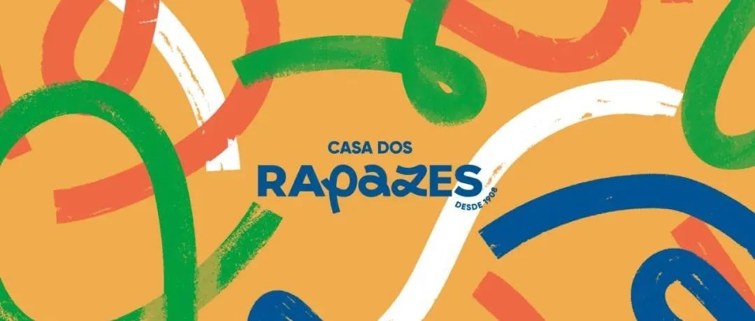
以此为灵感,新品牌隐藏了一点文字游戏。葡萄牙语中男孩(rapazes)一词隐藏在和平(paz)一词中。为了利用这一令人高兴的巧合,我们创造了一个新的标志,混合了书法和无衬线字体。基础日期在侧面呈现微笑,同时给予积极性和可信度。
IDEA
Having this as inspiration, the new brand hides a little word play. The portuguese word for boys (rapazes) hides within it the word peace (paz). To take advantage of that happy coincidence we created a new logotype mixing calligraphy and a sans serif type. The foundation date appears as a smile on the side, giving positivity and credibility at the same time.
图形元素
对于图形世界,由于旧品牌缺乏颜色,因此引入了快乐的颜色。为了保护孩子们的隐私,我们发现不使用他们的脸的限制是发展一种新语言的一种方式,这种语言将图片和插图结合在一起。
这种新的视觉标识使我们能够为Casa dos Rapazes活动、社交媒体、捐赠活动和网站创造新的环境。
GRAPHIC ELEMENTS
For the graphic universe, since the old brand was lacking in color, happy colors were introduced. To protect the boys' privacy, we found that the limitation of not using their faces was a way to develop a new language where pictures and illustration come together.
This new visual identity allows us to create new environments for the context of Casa dos Rapazes activities, social media, donation campaigns and website.
免责声明:
历届奥运吉祥物盘点
本文来自微信公众号“标志设计”作者:logoidea(ID:toplogocc)。大作社经授权转载,该文观点仅代表作者本人,大作社平台仅提供信息存储空间服务。


