

Serb is a logistics company that is based in Saudi Arabia. The name was selected as a plural to refer to our capabilities of spreading all over the world. Also, the “serb” or pack of birds is usually well communicated and fast moving and those are two necessary characteristics of successful logistics operations.
Logo concept
The logo represents a flying bird as a metaphor symbol that represents the core brand function of shipping. In addition to being related to the brand name Serb, meaning flock. The abstracted mark anatomy evokes the feelings of freedom and reachability while also indicating the business large size.
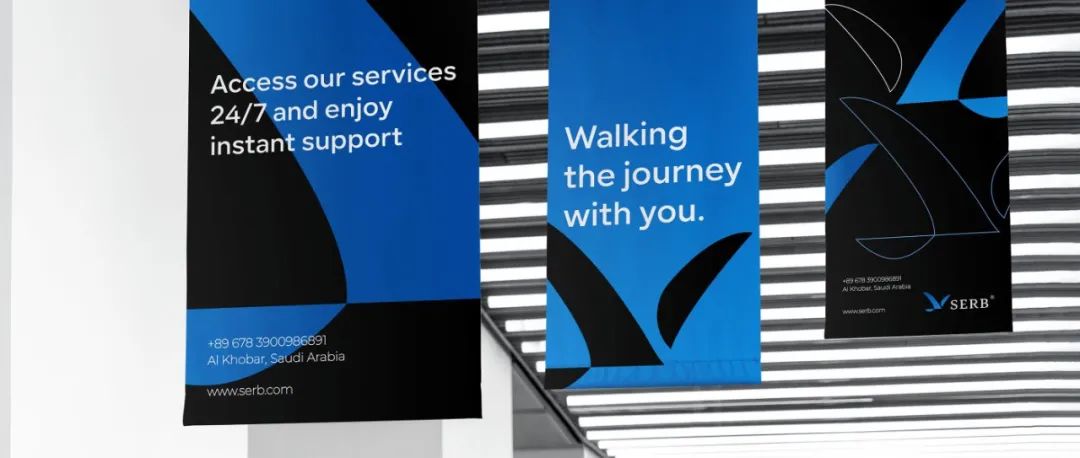
Brand Motif
The identity system relies on the wing as the master motif and utilizes it in a smart manner across the different spaces to create a unified visual language.
免责声明:
历届奥运吉祥物盘点
本文来自微信公众号“标志设计”作者:logoidea(ID:toplogocc)。大作社经授权转载,该文观点仅代表作者本人,大作社平台仅提供信息存储空间服务。


