

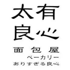
TAIYOU BAKERY
ベーカリー#太有良心麵包屋
TaiYou
TaiyouArt x TaiyouBakery
Taiyou brand design full case management
Too Conscious Bakery
United Taiyou culture brand design full case hosting design
Shenzhen Esports Association(SEA)
One By One Lab
深圳电竞协会,简称“sea”,是为电子竞技相关活动服务的公共机构。深圳是一座地理位置靠海的城市,和协会的英文简称呼应。因此,品牌将具有动感曲线的第一个字母“S”图形化,成为品牌的核心符号,既是海浪,也是一面行业旗帜。品牌形象围绕SEA(水属性,亦虚亦实,与电竞带给人们虚实体验的魅力享受具有异曲同工之妙)延展在整个视觉形象的风格体系中,表达电子竞技运动就像大海一样充满活力、激情、波涛汹涌,和电竞协会包容、公正的理念。
Shenzhen E-sports Association, referred to as "sea", is a public organization serving e-sports-related activities. Shenzhen is a city close to the sea, which perfectly matches the English abbreviation of the association. Therefore, the first letter "S" with a dynamic curve is graphically formed and becomes the core symbol of the brand, which is not only an ocean wave, but also an industry flag; at the same time, it is extended in the style system of the entire visual image, expressing that e-sports is like the sea Vibrant, passionate, turbulent, and the eSports Association's philosophy of being inclusive, fair, and setting industry benchmarks.
文章来源:NAN Design
版权归原作者所有,本资源仅供大家欣赏,学习交流,非恶意侵犯原权利人相关权益,如果侵害了您的合法权益,敬请相关权利人谅解并与我们联系,我们会在第一时间删除相关内容,共同维护好网络创作环境。
2022年十大设计趋势预测
2021日本字体设计年鉴电子版!
本文来自微信公众号“青圭設計學社”(ID:qingguisheji)。大作社经授权转载,该文观点仅代表作者本人,大作社平台仅提供信息存储空间服务。


