

JUNU
Vietnam
“用可爱的图案来描述情感”
JUNU is a natural juice store from Vietnam, full of fun, friendly and energetic style, providing customers with healthy and pure natural juice drinks.
这是一个有点俏皮可爱的logo,但也通过赋予logo大胆的笔触创造了力量。字母“J”最早是为了代表品牌的领域而创造的,字母“N”和“U”连接在一起,表示“Natural”和“User”两个词的连接,以表达品牌希望将自然产品出现在人们日常生活中。
This is a playful and lovely logo, but it also creates strength by giving bold strokes to the logo. The letter "J" was first created to represent the brand field, and the letters "N" and "U" are connected together, which indicates the connection between the words "Natural" and "User" to express the brand's wish to bring natural products into people's daily life.
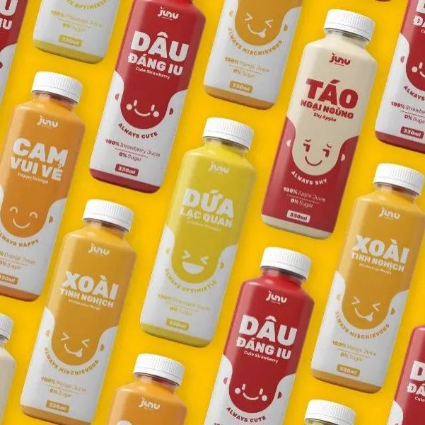
带着情绪的果汁瓶会帮助顾客产生与水瓶互动的感觉。JUNU的包装灵感来自于日常的人类情感,由Khac Duc为其设计,用可爱的图案来描述情感,搭配极简的色彩,突出品牌的个性,帮助用户更好地接触到JUNU的果汁产品。
Juice bottles with emotions will help customers feel the interaction with water bottles. JUNU's packaging is inspired by the daily human emotion, which is designed by Khac Duc. It uses lovely patterns to describe the emotion, matches with minimalist colors, highlights the brand's personality, and helps users get in touch with JUNU's juice products better.
Design:Khac Duc
* 本文仅作为创意分享,不提供售卖
张裕·巴保男爵®酒庄|水井坊·典藏|悠山酱酒|迎驾贡酒·大师版|张裕·瑞那®️城堡酒庄|夕下®️牌桂花酒 惬意好秋|泸州老窖·茗酿萃绿|赊店元青花·洞藏年份系列
本文来自微信公众号“甲古文创意”(ID:ocdwe2006)。大作社经授权转载,该文观点仅代表作者本人,大作社平台仅提供信息存储空间服务。


