

字母 T 的可变品牌形象
Brand identity
NO.1
Technical City – brand identity
for&st .co
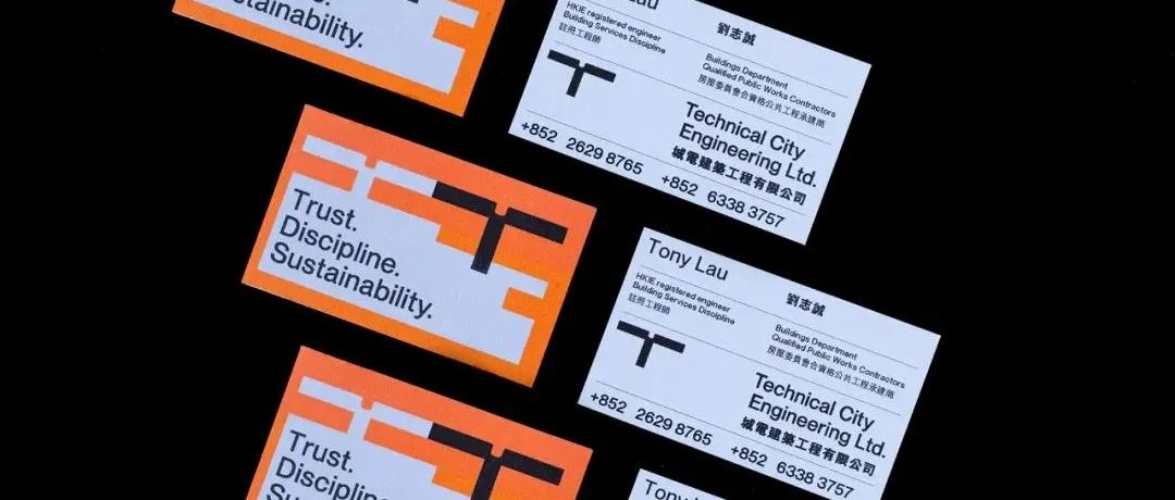
TECHNICAL CITY 技术的城市,“一步一步,一步一步,从地面开始建造。”
当地建筑承包商的品牌识别系统,取自技术城的首字母“T”,也象征着每一个建筑结构背后使用的钢筋,通过堆叠T部件,形成每一个混凝土结构。该模块系统还允许标识堆叠到不同的信息部分,因为构建的方式相同,并为未来的使用提供灵活的扩展。
“Steps by steps, parts by parts, built from the ground.”
Brand identity system for a local construction contractor, taken from the initial “T” of technical city, also symbolizes the rebars used behind every construction structure, by stacking up the T parts to form every concrete structure. The module system also allows the identity to stack up to different information sections, as the same way construction was built and provides flexible expansion for future usage.
NO.2
Tend – brand identity
gretelny
Tend是下一代个人理财平台,已在美国和墨西哥推出,致力于让每个人都能更好地获得财务福利。会员模式将金融技术与社交互动相结合,使人们更容易、更快、更人性化地获取、转移和增长资金。该系统使用三个简单的 T 字形组合来比喻 Tend 正在建设的社区:Tend 将人们聚集在一起,通过加入来共同充分利用他们的财务生活。T 可以与其他线条无限连接:这是 Tend 不断增长的、交织在一起的成员网络的直观表示。
The name is both a promise and a cue to the collective; Tend is active and intentional, warm andinviting. It implies caring for something other than oneself and nods to growth and progress; inherently human ideas. Paired with a direct and irreverent brand voice, and a boldly confident identity system, Tend steps forward as a visionary in personal finance.
以上设计作品版权归品牌和作者所有。
→ 往期推荐→
不听-茶饮品牌包装 | 清爽一夏
深圳华侨城OPOWER文化艺术中心
除了转发收藏,还很搞笑!
→ 领取福利 →
分享文章给朋友的朋友圈截图给南哥到微信收礼圈
microsoft-微软VI手册/电子版
xiaomi-小米VI手册/电子版
QQ-VI手册/电子版
以及《设计年鉴》电子版
本文来自微信公众号“NAN Design”作者:设计有点NAN(ID:NANGeDesign)。大作社经授权转载,该文观点仅代表作者本人,大作社平台仅提供信息存储空间服务。


