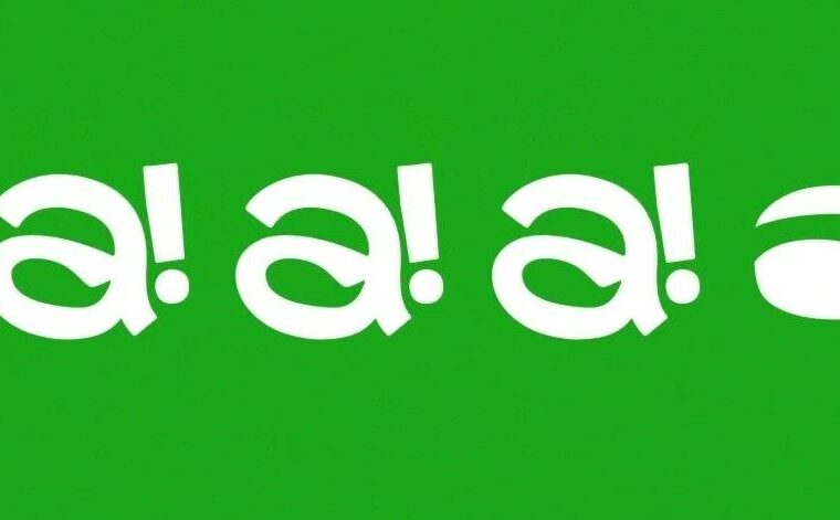
啊! 汉堡
a! Burger
Creative Agenc:rong-design
让品牌保持纯粹,简洁,
普世的同时富有明确的当代感和趣味性。
啊!汉堡是一家年轻的创新汉堡品牌。品牌的定位以契合当下年轻人健康,自由,随性的生活态度,来配以美味且无负担的汉堡产品。啊!代表美味的惊喜,同时代表的是随性的自然表达,设计将字母a与汉堡的主体进行了趣味的融合,合二为一,构成了品牌独一无二的视觉符号。在应用延展上,设计通过对符号的变形,叠加,组合等手法,塑造了具有明确识别,且强化了品牌轻松,自然无负担的核心定位。
Ah! Hamburg is a young and innovative burger brand. The brand positioning is in line with the healthy, free and casual life attitude of today's young people, with delicious and no-burden hamburger products. Ah! On behalf of delicious surprise, at the same time on behalf of the spontaneous natural expression, the design of the letter a and the main body of the burger for fun integration, a combination of the brand's unique visual symbol. In terms of application extension, the design creates a clear identification and strengthens the core positioning of the brand with ease, nature and no burden through the deformation, superposition and combination of symbols.
著作权归作者所有。
本文来自微信公众号“NAN Design”(ID:NANGeDesign)。大作社经授权转载,该文观点仅代表作者本人,大作社平台仅提供信息存储空间服务。