

2015.10
for shu uemura
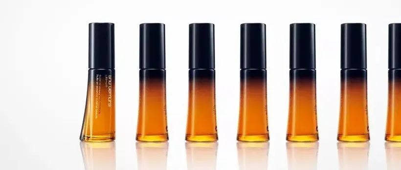
The package design for the oil-in-essence product which is part of the ultime8 range―the most premium line of cleansing oil category ―one of the representative items of the cosmetic brand, shu uemura. We designed a simple cylindrical bottle in an orange sepia tone with a dark-colored cap. While we emulated elements of conventional cleansing oil package of ultime8, we also incorporated a unique drape-like shape that looks like a ripple in one part to mirror the lithe movement from the rich flowing oil and depict cashmere-soft, transparent skin. Also, this design features a seamless integration of the cap and bottle, as well as the gradation of sepia and dark colors to represent the blend of various oils; an image inspired by the formula’s characteristic combination of 8 botanical-origin oils and geranium oil.
精华油产品的包装设计是ultime8系列(最优质的清洁油类别)的一部分,是化妆品品牌shu uemura的代表商品之一。我们设计了一个带有橙色棕褐色调和深色盖的简单圆柱瓶。在模拟ultime8常规清洁油包装的元素时,我们还采用了独特的悬垂状形状,其一部分看起来像波纹,以反映出丰富流动的油中的柔滑感,并描绘出羊绒般柔软,透明的皮肤。此外,这种设计的特点是瓶盖和瓶子的无缝结合,以及棕褐色和深色的渐变,以代表各种油的混合物。该图像是受配方中8种植物精油和天竺葵精油特有组合的启发。
申明:
内容版权自Nendo官网
未经许可,严禁转载,谢谢合作
我的翻译仅作参考,如觉翻译不妥,请跟我联系,探讨后可做修改,谢谢!
下一篇
本文来自微信公众号“佐藤大Nendo设计”(ID:gh_ce2c42193789)。大作社经授权转载,该文观点仅代表作者本人,大作社平台仅提供信息存储空间服务。


