

2009.09
for S.T Corporation
We redesigned a brand of electronic deodorizing and fragrance products whose lineup consists of the Shupatto deodorizing plug, a battery-operated device that regularly sprays deodorizing mist, and a wall-plug model that runs on electric current.(我们重新设计了一个电子除臭和香水产品品牌,其产品阵容包括Shupatto除臭插头,定期喷洒除臭雾的电池供电设备,以及电流运行的墙插式模型。)
The Shupatto plug emits light and sound alongside its fragrance. Since this multisensory experience is one of the product’s hallmarks, we wanted to make the plug feel more familiar, so that it could be incorporated into daily life rather than being hidden away in a corner of the room.(Shupatto插头散发出清新的光线和声音。由于这种多感官体验是产品的标志之一,我们希望让插头更加熟悉,以便它可以融入日常生活,而不是隐藏在房间的一角。)
The manufacturer’s request was to leave the plug’s base and inner structure as is. We were able to make the plug 25% smaller by removing unnecessary parts, and relocating others. This allowed the manufacturer to reduce manufacturing costs and the price for consumers.(制造商的要求是保持插头的底座和内部结构不变。通过移除不必要的部件并重新安置其他部件,我们能够将插头缩小25%。这使制造商能够降低制造成本和消费者的价格。)
We combined the release button and operating light into a single piece, and added a piece of removable tape that users simply pull away on first use, rather than inserting batteries. In addition to these simple but major improvements for user experience, subtle modifications like hiding the screws and joins in the casing increased the plug’s visual identification with a classic bar of soap, so that the plug feels even more like a natural part of a room.(我们将释放按钮和操作灯组合成一个单独的部件,并添加了一块可移动的胶带,用户只需在第一次使用时拉开,而不是插入电池。除了这些简单但主要的用户体验改进之外,微妙的修改,如隐藏螺丝和连接在外壳中增加了插头的视觉识别与经典的肥皂,使插头感觉更像是房间的自然部分。)
We redesigned the wall-plug version to coordinate even more closely with its electronic cousin, to strengthen and consolidate the overall brand image.(我们重新设计了墙插式版本,以便与其电子表亲更紧密地协调,以加强和巩固整体品牌形象。)
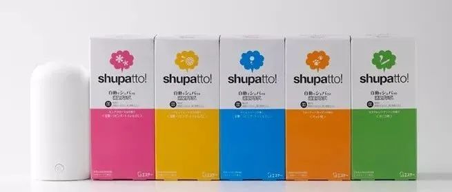
The iconic design of the packaging and store display design give consumers a direct sense of the products’ functionality and fragrance. We used colour to differentiate between the brand’s different products, increasing brand visibility on the shelf and guiding customers to find the right refills for each product upon return visits.(包装和商店展示设计的标志性设计让消费者直接感受到产品的功能和香味。我们使用颜色来区分品牌的不同产品,提高货架上的品牌知名度,并指导客户在回访时为每种产品找到合适的替换品。)
申明:
内容版权自Nendo官网
未经许可,严禁转载,谢谢合作
我的翻译仅作参考,如觉翻译不妥,请跟我联系,探讨后可做修改,谢谢!
本文来自微信公众号“佐藤大Nendo设计”(ID:gh_ce2c42193789)。大作社经授权转载,该文观点仅代表作者本人,大作社平台仅提供信息存储空间服务。


