RAIZIN
2017.04
for Taisho Pharmaceutical
Renewal project for the 5th anniversary of the ‘RAIZIN’ brand, the sparkling drink born and produced in Japan. The first action taken was to change the target customers from the current typical target market for energy drinks, and start afresh as a new type of drink for “people who have graduated from” energy drinks that provide substantial energy boost. This meant the target shifted from a wide group of people comprised of teenagers up to people in their twenties who like street culture and extreme sports, to smart and creative business people in their thirties and forties conscious of work-life balance.
Package Design
185 ml size pack smaller than a familiar 250 ml allows for the product to be more portable as well as drinkable in one gulp, making it feel like a ‘reset button’ during work breaks, more refreshing than coffee or a mint. Instead of the prior easy-to-drink flavour that emphasized sweetness, two flavours one of which is a strong “DRY” taste and the other a “MILD” clean and sweet taste were adopted, and were both packaged in a white can showing a polygon chart indicating “taste” and “stimulus”.
Elements on the packaging is kept to a minimum but the brightly coloured polygon is highly apparent and recognizable. This concept showcasing the polygon shapes was pushed in many forms such as posters, billboards, etc., trimming away any unnecessary information and keeping the campaign very simple.
Communication Tools
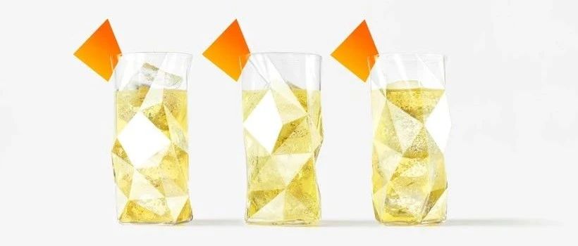
Keeping in mind the interaction between RAIZIN and the target consumers, various communication tools that will enhance the recognition of the brand, were designed. For instance, original glasses intended for use in restaurants and parties were specially designed, each was hand made by Sugahara glass artisans. The shapes are made up of a combination of several polygons, and the unique polygon that is on the product packaging is filled out in the colour white and the name “RAIZIN” printed in white would show up on the base of the emptied glass.
Coasters designed in conjunction with the glasses are also polygon shaped, as were the cards to put on the edge of the glass were prepared separately for buffet parties where coasters cannot be used. Furthermore, paper bags that fits one drink can was developed for handing out free sample cans on the street. The bags were designed not only from the viewpoint of the easiness to carry, but also to make one feel that they would want to carry it around, and to create a more special mood instead of handing out just the cans on their own. In addition, a plan that is designed so the polygon can become a part of our daily lives in various scenes, items that will naturally fit into an office environment are also in the pipeline to be developed, for instance, paper clips and sticky notes using polygons as motifs, and clear files that show the shape of a polygon when the documents inside are taken out.
Advertisments / Campaign
The TV commercials were produced based on the theme “Loop”, to reflect the product’s ability to mentally refresh through “stimulation”, and its ability to fine-tune the rhythm of daily life. 22 second videos that are joined at the beginning and the end that could be replayed infinitely were made, and by changing the cut-out point of the 15 seconds, 3 different TV commercials were made. A sense of oddity was borne out of these commercials that are similar but slightly different, or finish off at odd timings.
The video also portrayed “stimulation” by the performance of “Precision Walking” starting under a normal everyday situation and at the same time a sense of discomfort from “mysterious” actions abruptly starting. The movement of each individual was created by motion capturing the actual performance by experts of competitive “Precision Walking”. The motion was expressed by using CG which creates a sense of oddity, for the purpose of making audiences curious about the CM to be aired in the future. A dedicated app was developed for consumers to participate in the campaign by waving the polygon at the TV commercial or magazine advertisement, or by importing sound of the radio commercial. As another customer touchpoint, a digital clock for the website was also designed. Visual communication does not give out an impression as your “typical clock” or a “typical product campaign”, by using the corners of the polygon to indicate the “hour”, “minute”, “second” so the polygon is constantly changing its appearance.
“瑞尊”(RAIZIN)品牌五周年的更新项目,瑞尊是在日本生产和生产的气泡饮料。第一个行动是改变目前典型的功能饮料目标市场的目标客户,并为“毕业于”能提供大量能量提升的功能饮料的“人”重新开始作为一种新型饮料。这意味着目标人群从青少年到20多岁喜欢街头文化和极限运动的人群,转变为30多岁和40多岁意识到工作与生活平衡的聪明和有创造力的商业人士。
包装设计
185毫升的包装比熟悉的250毫升更小,使产品更便携,更适合一口饮用,使它感觉像一个“重置按钮”在工作休息时,比咖啡或薄荷更清爽。取代了先前容易饮用的甜味口味,采用了两种口味,一种是强烈的“干”味,另一种是“温和的”干净和甜的味道,都包装在一个白色的罐子里,显示一个多边形图表,显示“味道”和“刺激”。
包装上的元素被保持到最低限度,但色彩鲜艳的多边形是高度明显和可识别的。这个展示多边形形状的概念以海报、广告牌等多种形式呈现出来,去掉了任何不必要的信息,使活动变得非常简单。
通信工具
考虑到RAIZIN与目标消费者之间的互动,我们设计了各种各样的沟通工具来提高品牌的认知度。例如,原打算在餐馆和聚会上使用的眼镜都是专门设计的,每一种都是由杉原玻璃工匠手工制作的。这些形状是由几个多边形组合而成,产品包装上的独特多边形是用白色填充的,用白色打印的名称“RAIZIN”将显示在空玻璃的底部。
杯垫与杯子一起设计也是多边形的,因为放在杯子边缘的卡片是单独为自助餐准备的,不能使用杯垫。此外,还开发出能装一个饮料罐的纸袋,用于在街上分发免费的样品罐。这些袋子的设计不仅从便于携带的角度出发,还让人们觉得他们想要随身携带,创造一种更特别的氛围,而不是自己分发罐子。此外,计划,设计多边形可以成为我们日常生活的一部分在各种场景,东西自然会融入办公环境也在管道开发,例如,回形针和便签使用多边形作为主题,和清晰的文件显示一个多边形的形状在里面的文件。
广告/活动
以“循环”为主题制作电视广告,体现产品通过“刺激”刷新精神状态的能力,以及对日常生活节奏的微调能力。制作了一段从头到尾连在一起、可以无限重放的22秒视频,通过改变15秒的插播点,制作了3个不同的电视广告。一种奇怪的感觉从这些广告中产生了相似但略有不同,或结束在奇怪的时间。
该视频还描述了在日常情境下启动“精准行走”的表现,同时突然启动“神秘”动作带来的不适感。每个人的动作都是由竞技“精确行走”专家捕捉实际表现的动作创造的。动作用CG来表达,给人一种奇怪的感觉,目的是让观众对未来要播出的CM产生好奇。消费者可以通过在电视广告或杂志广告中挥舞多边形,或导入电台广告的声音,开发一款专用的app来参与活动。作为另一个客户接触点,还设计了网站的数字时钟。视觉传达不会给人一种“典型的时钟”或“典型的产品宣传”的印象,通过使用多边形的角来表示“小时”、“分钟”、“秒”,因此多边形的外观在不断变化。
本文来自微信公众号“佐藤大Nendo设计”(ID:gh_ce2c42193789)。大作社经授权转载,该文观点仅代表作者本人,大作社平台仅提供信息存储空间服务。