

蒲公英童书馆DANDELION
CHILDREN'S BOOK HOUSE
Design for : 田东明DMD
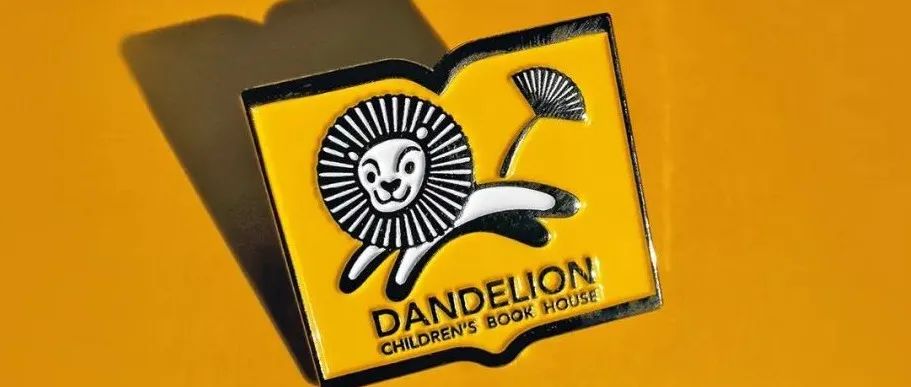
知名童书出版品牌蒲公英童书馆,15周年之际进行品牌形象重塑,小狮子的头发和尾巴都是蒲公英,外形为一本展开的书。动物形象更容易让标志“活起来”,与读者产生情感连接,讲述品牌故事,开发文创产品。标志更新后在中国绘本出版品牌中形成了鲜明的差异化,拉近了与读者的距离,受到了读者广泛的欢迎,小狮子的形象也便于后续开发绘本故事。
Dandelion Children's Library, a well-known children's book publishing brand, has rebranded its brand image for the 15th anniversary. The little lion's hair and tail are dandelions, and the shape is an unrolled book. Animal images are more likely to make the logo "come alive", create emotional connection with readers, tell brand stories, and develop cultural and creative products. After the logo update, it has formed a distinct differentiation among Chinese picture book publishing brands, narrowing the distance with readers and being widely welcomed by readers. The image of little lion is also convenient for the subsequent development of picture book stories.
老版标志以蒲公英花朵为主要元素,在书籍、特别是书脊上应用较难识别。更新后的标志以动物为主要元素,更容易让小朋友记住,产生情感联系。
老版标志的应用,绘本封面多出现较为丰富的画面,所以没有“安全区”的标志,比较不易识别。
老版书脊标志应用
更新后更好识别,加强记忆。
书脊一般较窄,采用“狮头”,更加清晰,黄色的“书”是安全区域,将多彩丰富的画面与标志进行信息区隔。
以上设计作品版权归品牌和作者所有。
FIE世界击剑锦标赛的官方标志系统
美团吉祥物升级!
ABCD最新作品集(二)
本文来自微信公众号“NAN Design”(ID:NANGeDesign)。大作社经授权转载,该文观点仅代表作者本人,大作社平台仅提供信息存储空间服务。


