

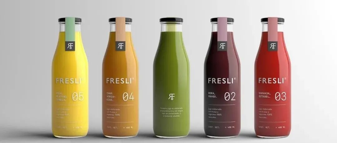
Fresli是用100%的天然水果和蔬菜手工制作的果汁,对于它的图形标识,选择了代表产品新鲜度的调色板,基于自然的减弱的颜色。
对于包装,选择了一个干净和简单的设计,但对每一个细节都特别关注。赋予他一种中性的个性,但同时又是与众不同的;这将赋予品牌本身的自然特征,并为新产品的开发留有余地。
Fresli is a juice made by hand from 100% natural fruits and vegetables, for its graphic identity we chose a color palette that represented the freshness of the product, attenuated colors based on nature.
For the packaging we opted for a clean and simple design, but taking special attention to every detail. We endow him with a neutral personality, but at the same time distinguished; that would give that natural character of the brand itself and leaving the way open for the development of new products.
”
THE END
所有图像和设计品的版权均归其各自作者所有
PackHorizon|Day & Night 啤酒包装设计
PackHorizon|Nostra 披萨店品牌包装设计
PackHorizon|Dragic Vina 葡萄酒包装设计
分享世界灵感,探索包装设计
PackHorizon 分享所有与包装相关的时尚行为
www.PackHorizon.com
联系我们请扫下方二维码
欢迎加微信来撩
☻
下一期并不会更精彩,但还是值得期待。
本文来自微信公众号“PackHorizon”(ID:PackHorizon)。大作社经授权转载,该文观点仅代表作者本人,大作社平台仅提供信息存储空间服务。


