Design for “media luxe,” a brand newly launched as the successor to the Kanebo Cosmetics “media” makeup brand.
In considering a design that would give the impression of unity across several different products, the “serif” became the focus. Serifs are small decorations on the edges of Latin typefaces. They give fonts a minimal yet dignified impression and a sense of formality. This being translated into products, the same visual effect and comfort of use were created. By arranging “serifs” to match the mechanism of each container’s lid, the product becomes easy to open—the lipstick lid can be pulled off, the cream bottle rotated, and the compact opened with little force. The logo, placed as an accent on the products, was also designed with serifs.
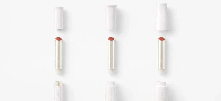
The body of lipstick is available in three types, designed to accept a common refill. The difference in shape is based on the idea of offering a form as close as possible to something that “feels right” for different people and different scenes.
Firstly, a lipstick that emphasizes a good balance of thickness and weight. The skirted shape of the body makes it easy to grasp the end, and the cap is designed to give the user a feel that it is securely closed with a “snap.” The second lipstick has a built-in weight in addition to its plump shape. While providing a firm grip, the moderate weight of the product prevents the applicator from shaking during use, thereby increasing self-standing stability. Furthermore, the lipstick stands upright, and the cap closes smoothly to the touch. The third one is a slim, lightweight aluminum product, suitable for holding lightly with fingertips. While the cap gives a sense of lightness when it is opened, the user still can feel secured with the tight closure when carrying it.
In this way, the whole brand was first unified by the serif, a combination of functionality and design, and three different types of comfort were instilled in the lipstick products. The design aims to reflect the brand story of not being overdressed, but rather, bringing a natural, individual beauty into daily life.
“ Media Luxe”的设计,这是一个全新推出的Kanebo Cosmetics“ Media”化妆品牌的继任者。
在考虑一种将在几种不同产品中给人留下统一印象的设计时,“衬线”成为重点。衬线是拉丁字体边缘上的小装饰。它们给字体带来了最小而庄重的印象和形式感。将其翻译成产品,创建了相同的视觉效果和舒适的使用。通过安排“衬线”以匹配每个容器盖的机制,产品变得易于打开 - 可以将口红的盖子拉开,旋转奶油瓶,紧凑型用很少的力打开。该徽标作为产品上的重音放置在产品上,还使用衬线设计。
口红的主体有三种类型,旨在接受常见的补充。形状的差异是基于提供尽可能接近的形式的想法,即对不同的人和不同场景“感觉正确”。
首先,一种强调厚度和体重平衡的口红。身体的裙子形状使人可以轻松掌握末端,并且帽子的设计旨在使用户感觉到它可以用“快照”牢固地封闭。第二个口红除了丰满的形状外还具有内置重量。在提供牢固的抓地力的同时,产品的适度重量阻止了涂抹器在使用过程中摇晃,从而提高了自动稳定性。此外,唇膏直立,盖子平稳地闭合。第三个是纤薄的轻质铝产品,适合用指尖轻轻握住。尽管盖子打开时盖子会产生轻度的感觉,但用户仍然可以在携带时紧密闭合而感到固定。
这样,整个品牌首先是由衬线统一的,功能和设计的结合,以及在口红产品中灌输了三种不同类型的舒适性。该设计旨在反映出没有穿上衣服的品牌故事,而是将自然的个人美丽带入日常生活。
本文来自微信公众号“佐藤大Nendo设计”作者:Mao Mouth(ID:gh_ce2c42193789)。大作社经授权转载,该文观点仅代表作者本人,大作社平台仅提供信息存储空间服务。