

Lawson private brand logo & packaging
2020.04
for Lawson
While many Japanese convenience store chains develop and offer private brand products under a unified image, Lawson operates multiple brands according to product type and target customer base: MACHI Café for coffee, Uchi Café for sweets, and NATURAL LAWSON for healthy goods, as well as branded fried chicken and rice balls. Such a system provides customers the joy of selecting from among highly specialized and distinctive brands, as if the convenience store were a shopping mall, but it also impedes the ability to appeal the Lawson brand itself. And so a visual identity system came to be considered, one maintaining the traits of each brand while creating a sense of unity under Lawson.
虽然许多日本便利店连锁开发和提供私人品牌产品是一个统一的形象,劳森却经营多个品牌根据产品类型和目标客户群:麻吉咖啡馆喝咖啡,Uchi咖啡馆吃甜食,和自然劳森健康产品,以及品牌的炸鸡和饭团。这种系统为顾客提供了从高度专业化和独特的品牌中进行选择的乐趣,就好像便利商店是一个购物中心,但它也妨碍了劳森品牌本身的吸引力。因此,人们开始考虑视觉识别系统,即在劳森的领导下保持每个品牌的特征,同时创造一种团结感。
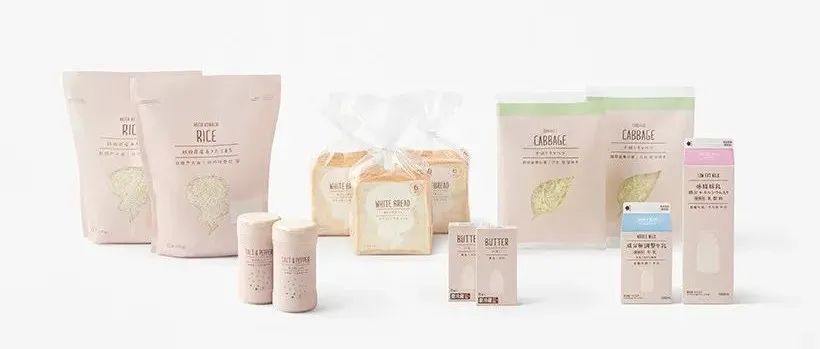
First, the silhouette from Lawson’s main logo and its L were taken to develop a highly recognizable and serviceable private brand icon, the‘ L-logo’. It was conceived that, by having the L-logo change into existing brands as if the latter were costumes, a connection could be tied elegantly to the Lawson brand without damaging its former, conventional image. Other private brand products were included in a regular assortment for everyday life and labeled ‘L basic’, taking on the L-logo without modification. Packages are unified—with milk, eggs, bread, and other such foods in beige, and tissues,soap, and household goods in gray—and designed with silhouette illustrations to indicate package contents. Product names are indicated in four languages—Japanese, English, Chinese, and Korean—to accommodate overseas visitors. To reduce visual clutter once products enter the customers’ living spaces, prices and product descriptions are written clearly on the store POP displays. Food products outside L basic are branded as ‘L marche’ and placed into 4 categories—frozen foods, snacks, fast foods, and others—with features of each category added to the L-logo. In pursuit of a soft look that also appeals to non-regular female customers, a cozy font and hand-drawn illustrations depicting package contents and ingredients in an easy to understand manner are patterned across packages, rather than favoring large product photography like those covering the old packaging. The designs of Lawson’s nearly 700 private brand products, sold in approximately 14,000 stores nationwide, were systematized in a project under taken in the hopes of bringing a little joy and comfort to everyday life.
首先,从劳森的主要标志和它的L剪影被开发一个高度识别和服务的私人品牌图标,“L标志”。它的构想是,通过把L-logo变成现有的品牌,就好像后者是服装一样,可以与劳森品牌优雅地联系在一起,而不会破坏它之前的传统形象。其他私人品牌的产品包括在日常生活的常规分类和标签“L基本”,采取的L标志没有修改。包装是统一的——牛奶、鸡蛋、面包和其他米色的食品,纸巾、肥皂和家用物品是灰色的——并设计了剪影插图来表明包装的内容。产品名称用四种语言表示——日语、英语、汉语和韩语——以适应海外游客。为了减少视觉混乱,一旦产品进入顾客的生活空间,价格和产品说明清楚地写在商店的流行显示。L basic以外的食品被标记为“L marche”,分为冷冻食品、零食、快餐和其他4类,每个类别的特征都被添加到L-logo上。为了追求一种柔软的外观,同时也吸引非固定女性客户,一个舒适的字体和手绘插图,以一种容易理解的方式描述包装内容和成分是图案的包装,而不是喜欢大型产品的照片覆盖旧包装。劳森近700个私人品牌产品的设计,在全国大约14000家商店销售,在一个项目中被系统化,希望给日常生活带来一点快乐和舒适。
01.branding
02.L basic / daily foods
03.L basic / daily items
04.L marche
05.COVID-19 prevention campaign
申明:
内容版权自Nendo官网
未经许可,严禁转载,谢谢合作
我的翻译仅作参考,如觉翻译不妥,请跟我联系,探讨后可做修改,谢谢!
本文来自微信公众号“佐藤大Nendo设计”(ID:gh_ce2c42193789)。大作社经授权转载,该文观点仅代表作者本人,大作社平台仅提供信息存储空间服务。


