

trophy for Wallpaper*
2012.01
for Wallpaper* Design Awards
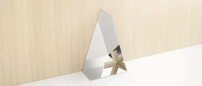
The design for the trophy presented to the winners of all eleven categories in British design magazine Wallpaper*’s annual Wallpaper* Design Awards. The trophy’s form is derived from the image of a sheet of paper – like the magazine itself, ordinarily flat – twisted and folded into a three-dimensional object so that it can be handed to the winners. Since Wallpaper*’s logo is the five-pointed asterisk found at the end of its name, we folded the ‘paper’ at a 72 degree angle, the same angle found between the spokes of the asterisk. An internal mirror then reflects a ‘cut-out’ at a 72 degree angle to recreate the asterisk logo inside the trophy. The background of the trophy reflects the logo like a kaleidoscope, creating beautiful patterns and colors, so we hope that the award winners will enjoy deciding where to place the trophy. The heterogeneous and always-changing patterns created inside the logo also reflect Wallpaper*’s quick, chameleon-like ability to identify and highlight emerging trends around the world.
奖杯的设计在英国设计杂志《墙纸》的年度墙纸设计奖中颁发给了所有十一个奖项的获奖者。该奖杯的形状是由一张纸的图像演变而来的——就像杂志本身一样,通常是平的——扭曲并折叠成一个三维物体,这样就可以交给获胜者了。因为壁纸的标志是名字末尾的五边形星号,所以我们把“纸”折成72度角,和星号辐条之间的角度一样。然后,内部的一面镜子反射出一个72度角的“镂空”,重现了奖杯内部的星号标志。奖杯的背景反射出的标志像万花筒一样,创造出美丽的图案和颜色,希望获奖者能享受决定奖杯的位置。标识内部创造的异质和不断变化的图案也反映了墙纸*快速,变色龙般的能力,识别和突出世界各地的新兴趋势。
申明:
内容版权自Nendo官网
未经许可,严禁转载,谢谢合作
我的翻译仅作参考,如觉翻译不妥,请跟我联系,探讨后可做修改,谢谢!
本文来自微信公众号“佐藤大Nendo设计”(ID:gh_ce2c42193789)。大作社经授权转载,该文观点仅代表作者本人,大作社平台仅提供信息存储空间服务。


