

cleverin
2018.09
for Taiko Pharmaceutical
A brand renewal project for a virus removal and disinfection product. Using chlorine dioxide molecules, “cleverin” removes viruses and bacteria floating in the air.Although the product existed as the market leader in Japan for a long time,research has shown that its function and use has not been clear enough for the customer.
一种病毒去除和消毒产品的品牌更新项目。利用二氧化氯分子,“cleverin”清除了漂浮在空气中的病毒和细菌。虽然该产品在日本作为市场领导者存在了很长一段时间,但研究表明,其功能和用途对消费者来说还不够明确。
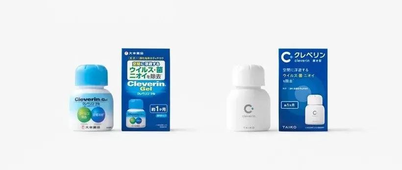
One problem to be solved was that once you started using it,it was hard to tell when the product should be replaced. This often resulted in the purchaser using the product even after the effect had diminished or stopped. The first step was to work on the packaging, the initial touch point of the product. So as not to confuse the existing customers, the color combination of the blue colour scheme was maintained, enabling recognition and familiarity for the customer.
需要解决的一个问题是,一旦你开始使用它,就很难知道什么时候该更换产品。这常常导致购买者在效果减弱或停止后仍在使用产品。第一步是包装,产品的最初接触点。为了不让现有的客户产生混淆,保持了蓝色配色方案的色彩组合,让客户识别和熟悉。
As to enhance the visibility in the stores, the gradation on the package has been redesigned to circles with 3 different colour tones. With the same intention, the product name was designated in Japanese Katakana, which was formerly in English, and the information was arranged in the order of “Brand Name -> Product Classification -> Function -> Capacity /Quantity -> Company Name” so that the information with higher priority can be found easily from the top to bottom.
为了增强商店的可见性,包装上的层次被重新设计成带有3种不同色调的圆形。相同的目的,产品名称指定的在日本的片假名,曾在英语,和信息的顺序安排的“品牌名称->产品分类- >功能- >能力/数量- >公司名称”与更高的优先级,以便信息可以很容易从上到下找到。
To reduce purchasing mistakes, the colour on top of the packaging was varied according to the classification – “light blue” was used for the standing type and “emerald green” was used for the stick type. The logo mark “C” which looks as if the letter is biting the virus, has also been emphasized and placed on the top left section, which will enable brand recognition in the future when there is not much space to list the product name.
为了减少购买错误,包装顶部的颜色根据分类进行了变化——“淡蓝色”用于站立式,“翠绿色”用于棍式。标志“C”看起来像咬病毒的字母,也被强调,并放在左上角部分,这将使品牌识别在未来没有太多的空间来列出产品名称。
The information previously on the product itself were removed, so that the product will not disturb the surroundings. A new“dedicated case” was developed for customizing the colour and pattern, with arotating dial that indicates the expiration date. The dial is easy to set, and aims to increase the opportunity for users to replace the product appropriately.
之前关于产品本身的信息被删除了,这样产品就不会对周围环境造成干扰。一种新的“专用盒”被开发出来,用于定制颜色和图案,带有一个旋转表盘,指示到期日期。表盘易于设置,旨在增加用户适当更换产品的机会。
01.package
02.case
03.cleve&and
申明:
内容版权自Nendo官网
未经许可,严禁转载,谢谢合作
我的翻译仅作参考,如觉翻译不妥,请跟我联系,探讨后可做修改,谢谢!
本文来自微信公众号“佐藤大Nendo设计”(ID:gh_ce2c42193789)。大作社经授权转载,该文观点仅代表作者本人,大作社平台仅提供信息存储空间服务。


