

SEVEN SKIES
Wine
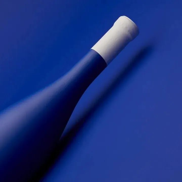
“少即是多—极简美学”
整体的包装设计风格简单素雅,除了品牌的标识之外,瓶身设计上没有任何多余的装饰,大片的留白设计为人们对酒体留下无限的遐想。
视觉颜色上克莱因蓝色与白色碰撞出更多活力,形成差异化包装,抓人眼球。同时,更有意思的是瓶身使用“磨砂”工艺丰富的酒瓶包装的质感,体现了白葡萄酒的柔顺醇美的产品特性。
The overall design of the packaging is simple and elegant. Apart from the brand logo, the bottle is designed without any unnecessary decoration, leaving a large white space for people to think about the wine.
The visual colours of Klein blue and white collide to create a more dynamic and eye-catching packaging differentiation. The use of a "frosting" process on the bottle is also interesting, enriching the texture of the packaging and reflecting the soft and mellow nature of the white wine.
The "SEVEN SKIES" showcases the minimalist design aesthetic of less is more. When the market is filled with elaborate and decorative designs, the right amount of white space can evoke a sense of beauty.
葡萄牙插画风 | 以绘画艺术为辅的设计 | 雪碧全新logo登场 | 金点设计奖 | 往期获奖设计回顾 |往期Pentawards优秀作品展示 | 自然赋予的灵感 | 崇尚自由冒险的精神 | 好玩到冒泡设计表达法|卷纸的特殊使命|一颗“咖啡豆”的灵感|趣味包装设计美学|让内卷“可爱”起来|巧妙的彩色绘画|波普艺术创意设计|享一口精致的“巴西风”奶酪 | “520” 礼物,请查收!
本文来自微信公众号“甲古文创意”(ID:ocdwe2006)。大作社经授权转载,该文观点仅代表作者本人,大作社平台仅提供信息存储空间服务。


