WOMO 宠物行业的新星
ART DIRECTOR: Guang Yu / Nod Young
WOMO是宠物行业的新星,主营猫粮产品定位在中高端。需要在品牌宣传上,并在市场上定义出一种具有标志性、差异性和高品质的设计语言,让消费者快速进入行业新品牌“的能力是欠缺的,需要通过更直接的来传递简单朴实的品牌特征,设计师认为中粮需要向消费者提出的要求”:从产品形态,改变了桶形结构,改变了不同的形状保存,方便取出。明亮的不同风格的展示,更能展示的新鲜和美味的结构;更多的气泡框,增加了版式内容的趣味性和逻辑关系;在内容表达材料工艺上,考虑了细节的细节。从表面上看,希望在WOMO的粮粮时,能够以品牌对品质的追求,同时结合一个完整的品牌形象和猫的个性。是比较辛苦的更让主人在挑剔。能在猫类品牌上希望多一些的、有趣的语言,让主人在和使用产品的过程中也选择“关注”的,这就是设计对WOMO(谐音“我猫”)的一种解读方式吧。
WOMO, as a new star in the pet industry, has positioned its main cat food products in the middle and high-end market. We need to find and define a symbolic, differentiated and high-quality design language for the brand image in the industry, which allows consumers to quickly recognize it and desire to buy the products. The new brand shows poor performance in “telling stories” but needs to convey simple and uncomplicated brand features in a more direct way. We consider that the mid- and high-end cat food should tasty, fun and good-looking. In the product form, we changed the original large package into a barrel-shaped package that can be preserved for a long term and easy to take out. At the same time, we designed different content structures for the barrel-shaped structures in different sizes and specifications. Bright and highly saturated colors better reflect the freshness and deliciousness of food; illustrations and bubble boxes bring more fun and a logical relationship to the layout; more details were considered in the content presentation and materials technology. We hope that consumers will see the pursuit of this brand for quality when getting the WOMO cat food, and gradually have a complete view of brand recognition in the combination of deliciousness and fun.Cats have special personalities, so cat owners are always laborious and picky. We hope there are some more distinctive and interesting languages for the cat brand building, and let the cat owners receive “special attention” in the process of choosing and using products. This is our interpretation of WOMO (it sounds like “my cat”).
MITATA 眼神交流艺术家
ART DIRECTOR: Guang Yu / Nod Young
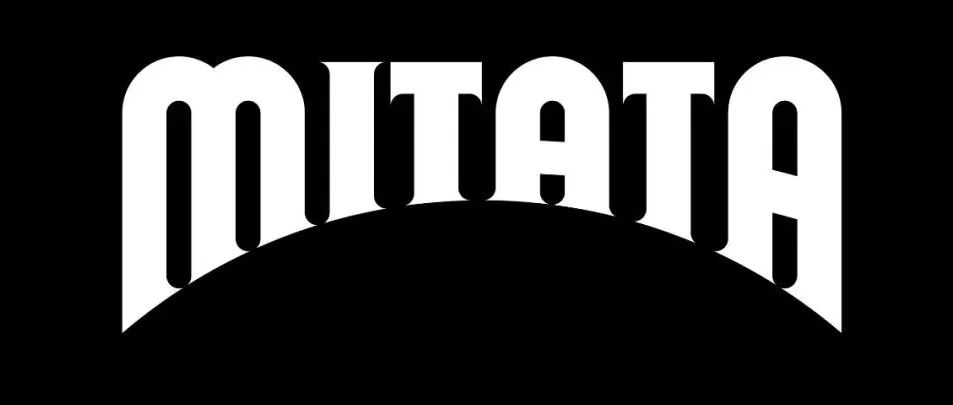
MITATA 的品牌定义是:眼神交流艺术家。作为一家美瞳企业,MITATA 所理解的产品美学是非常独特的,是一种介于个人需求与社交需求之间的产品需求,也就是美瞳除了悦己(艺术家),更担负着社会交往中沟通(眼神交流)的作用。这就要求 MITATA 的品牌设计既能满足个性化、多样化需求,同时也能满足社交需求中的高识别性以及风格化的特点。将社交需求部分转译成:MITATA 有专属且强烈的设计语言风格,且能在传播过程中担负起过目不忘的功能,像一个“眼神交流艺术家”。
佩戴了美瞳的眼睛,就像获得了魔法一样,一瞬间变得闪闪发光,深邃动人。我们从“魔法的眼睛”这个角度去寻找设计语言的落脚点,通过独特的字体形式去营造魔法带来的神秘和魅惑感,并且大胆地将标识底部设置为非常显性的圆拱形。MITATA 的标识字体是综合了现代几何造型与古典衬线设计而成的,其古典衬线的特点让标识更富神秘感,同时几何造型又避免了单纯的古典造型带来的陈旧感,完美地平衡了现代与古典之间的关系。圆拱形设计是 MITATA 最重要的识别特征,其设计用意是:强装饰性与高识别性。MITATA 的标识在包装和广告画面中通常以最大尺度进行使用,标识底部的圆拱便成为衔接内容的主要装饰,无论是文字还是图片,都能在圆拱形结构的烘托下显得更加典雅和充满神秘气息。并且,由于标识的大尺度使用,使得 MITATA 在识别性上获得最大程度的输出,表现出自信和个性的一面。通过带有魔法感的字体和圆拱的结合设计了 MITATA 的标识,同时以标识为核心建立了一整套兼顾古典神秘与现代大胆的视觉识别系统,配合优雅精致的模特影像,MITATA 独特的美学风格被成功地建立起来,在竞争激烈的市场中脱颖而出,成为众多女性消费者心中的新“女神”形象。
The brand of MITATA is defined as an eye contact artist. MITATA, as a company of cosmetic contact lenses, has its unique understanding of product aesthetics that falls between individual needs and social needs. That is to say, cosmetic contact lenses play a role of social communication (eye contact) while pleasing people themselves. It requires MITATA’s brand design to meet personalized and diversified demands and conform to its high recognition and stylized features in social needs. We translated the social needs as follows: With an exclusive and sharp design language style, MITATA can function as an unforgettable “artist of eye contact” in the communication process.
The eyes with cosmetic contact lenses will instantly become twinkling and attractive magically. We looked for the foothold of design language from the perspective of “magic eyes”, created the mystery and charm of magic with the unique font form, and boldly set the bottom of the logo as a very dominant circular arch shape. The wordmark of MITATA was designed in the combination of modern geometric modeling and classical serif, and the characteristics of classical serif make the logo more mystery. At the same time, the geometric modeling also avoids the old-fashioned style that a completely classical shape brings, which allows the relationship between modern and classical styles to be perfectly balanced.
The most important recognition feature of MITATA is its circular arch design, for the intention of good decoration and high recognition. The logo of MITATA is always used in the maximum size in packaging and advertising pictures, and the circular arch at the bottom is the main decorative link for contents. Both the word and image appear to be more elegant and mystery in such an arch structure. In addition, the logo used in the maximum size seems to be high recognized, expressing its confidence and individuality.
The MITATA logo was designed in a combination of magical fonts and arch structure, and a complete visual identity system giving consideration to classical mystery and modern bold styles has been established by taking the logo as the core. MITATA, together with elegant and exquisite model images, has successfully established its unique aesthetic style. It stands out in the competitive market and becomes a new “goddess” in the heart of many female consumers.
乎兮HUXI
ART DIRECTOR: Guang Yu / Nod Young
乎兮的设计过程,像一段未知且美好的旅程。未知,是目的的不确定性;美好,是在探寻过程中获得的意外惊喜。在设计师看来,正是有了未知的目的,才收获了这份令人惊喜的美好。乎兮,是服装品牌,更是科技品牌。甚至,乎兮先是科技品牌,再是服装品牌。乎兮,通过数年的努力,将一根线的特质发挥到极限,织成立体的、富有弹性与支撑的、温润亲肤的服装。这是科技的艺术,更是人类想象力的又一次突破。在极具创新的新观念面前,从前的经验变得无所适从,正是在这样的状态下开始了乎兮的设计之旅。
“线织成梦”,乎兮的品牌形象始于最原始的线,通过变化结成梦幻般的表面。乎兮的品牌视觉正是还原了从织物到服装的演化过程,从一根线,到一块布,到一件美丽的衣服。首先,乎兮的标识,具有松与紧的两种不同形态,用以描述更自由与更贴身的产品特质,同时也是给了乎兮(呼吸)更为具体化的视觉呈现。此外,平行于乎兮标识识别的是一套丰富的图案识别系统。图案系统的基本元素源自于乎兮标识中的“线”,通过改变线的角度、灰度、位置来形成织物般的表面肌理,并赋予丰富的色彩关系,产生流动愉悦的视觉感受——将线织成梦,完成从最单纯到最丰富的过渡,将科技与艺术完美融合,从而形成乎兮品牌特有的视觉识别。
在设计过程中,我们用大量时间去思考如何定义一根线,认定在这个最基本的元素中,一定蕴藏着极为不寻常的可能性。最终,我们寻找到的方法是给这条线以自由,让它伸展、生长、舞动,像自由奔跑的女孩,像飞速闪过的灵感,像慢慢展开的梦网,而这正是乎兮呈现出的对服装的全新理解。
The design process of HUXI is like an unknown and beautiful journey. The word unknown refers to the uncertainty of purpose, while beautiful means the unexpected surprises that appear in the process of exploration. In our opinion, it is exactly the unknown purpose that leads to such surprising and beautiful results.HUXI seems more like a technology brand than a clothing brand. Even in our eyes, HUXI is firstly a technology brand before being a clothing brand. Through so many years of efforts, HUXI has given play to the quality of a thread to the limit by weaving it into three-dimensional clothing that elastic, supportive, warm and skin-friendly. This is not only the art of technology but another breakthrough in human imagination. Previous experience has lost its purpose in front of the new innovative ideas. We just started our design of HUXI in such a state.“Threads are woven into dreams”. HUXI’s brand image begins with weaving the most original threads into dreamlike surfaces through changes. In our view, HUXI’s brand vision restores the course of evolution from fabric to clothing, from a thread, to a piece of cloth and finally a piece of beautiful clothing. First of all, HUXI’s logo is presented two different forms, loose and tight. The two forms are used to describe the freer and more close-fitting product quality, and embody HUXI visually. In addition, there is a rich pattern recognition system parallel to HUXI’s logo recognition. The basic elements of the pattern system come from the “threads” in the logo. The angle, gray scale and position of lines in the logo are changed to form the surface texture of fabric and create abundant color relationships. It gives us a flowing and pleasant visual experience of weaving threads into dreams, completing the transition from the purest to the richest. This is a perfect integration of technology and art, which forms the unique visual identity of HUXI.We spent much time thinking about how to define a thread in the design process. We believed that there must be extraordinary possibilities contained in the most basic elements. Ultimately, we decided to give this thread freedom and let it stretch, grow and dance as a free running girl, inspiration flashing quickly and a slowly unfolding dream web. This is exactly HUXI’s new understanding of clothing.
Dr. Cheese 奶酪博士
ART DIRECTOR: Guang Yu / Nod Young
作为成长最快的奶酪制品品牌,奶酪博士以宜人的口感、优质的奶源、风格化的形象,吸引了越来越多的消费者。设计中,排除了所有装饰化语言,仅保留最纯粹经典的“奶酪孔”,并以此作为品牌的基础视觉基因,强调品类的专业性,建立起经典、可靠和友好的视觉形象。
As a cheese brand in a fast-growing speed, Dr. Cheese is attracting more and more consumers with its pleasant taste, high quality milk and stylized image. In design, we excluded all decorative design language and kept only the purest classic 'cheese hole' as the visual gene, emphasizing professionalism and establishing a classical, reliable and friendly brand image.
ABCD最新作品集(一)
巴莉甜甜·城市建设BERRY PROJECT
著名汽车品牌:雪铁龙换logo了!
本文来自微信公众号“NAN Design”(ID:NANGeDesign)。大作社经授权转载,该文观点仅代表作者本人,大作社平台仅提供信息存储空间服务。


