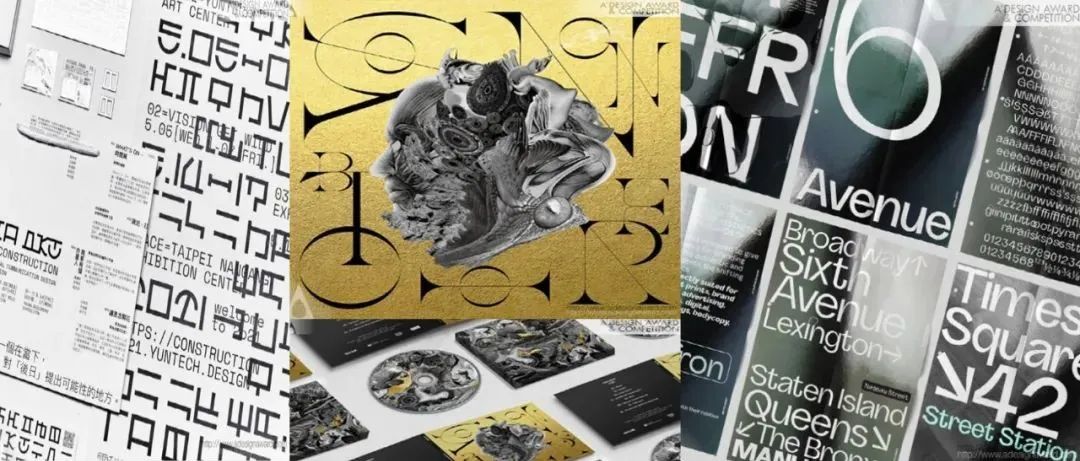
Normally, the weight of a typeface changes, but its skeleton does not change significantly. For a long time, I have been wondering if it is possible to create a typeface whose skeleton also changes when its weight changes. Also, in general signage projects, the typeface used is limited in order to give a sense of unity to the space, but I was wondering if it would be possible to change the typeface to match the function of the space. These two ideas became the inspiration for this design.
Environment-oriented design development has finally become widespread in Japan, but it is still not enough. Communication designs such as logos, packages and tools incorporate high quality and ethical awareness in every respect. The mission is to "provide an experience as if you were in the production area". It wanted to embody a sincere attitude of pursuing design creatively and sustainably. The idea of design is to convey reality without abstraction. I felt that the expression was a simple and direct way to convey it to consumers.
In this new identity we find the book, already familiar from the historic logo - represented by the illustration of a closed book resting on its side - but with an important change: it is an open book, a powerful symbol of accessibility, because it is open and accessible to the entire Biblioteche network
Main inspiration for this project were comics and classic French noir cinema. The concept for the first illustration came from a reference photo I received from the client, which was a shot of a chair from behind and at a very low angle. It was very unusual and sparked loads of questions in my head. Being a fan of detective stories I decided to follow this approach in the layout of the image. The first image was crucial in setting the tone for the whole series.
这个项目的主要灵感来自漫画和经典的法国黑色电影。第一张插图的概念来自我从客户那里收到的一张参考照片,这是一张从椅子后面以非常低的角度拍摄的照片。这很不寻常,在我脑海中引发了一大堆问题。作为一名侦探小说迷,我决定在图像的布局上遵循这种方法。第一张图片对整个系列的基调至关重要。
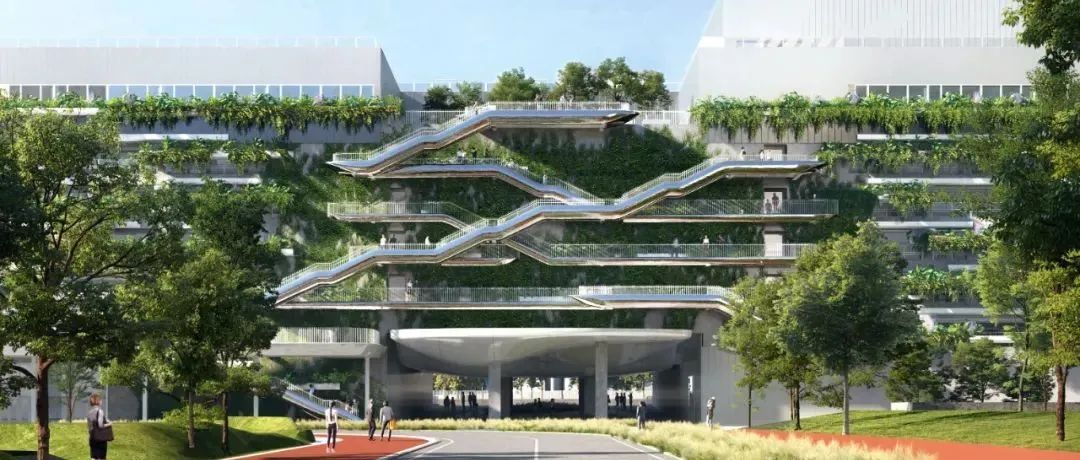
The project is designed for the demonstration area of a large park-themed residence with Corbusier’s modernist architectural style. It’ll be transformed into a local culture center after residential deliveries. UPD extracts Corbusier architectural language into wayfinding-sign design on landscaping belts and entrance paths. It makes aesthetic architectural aura easily available everywhere in a vivid way. A more 3D space experience is ingeniously created by the wayfinding signs here and there.
Holan mountain rock painting is a precious ancient civilization heritage of China. Nowadays, due to environmental reasons, it is gradually disappearing, but many people still don't know its existence. Therefore, I have planned a digital art festival of Holan Mountain with the theme of across. The main visual performance of this festival is to redesign the rock paintings digitally as a kind of digital protection, so that they can be spread and applied in the contemporary era and play the contemporary value of ancient culture.
Feng Art Museum implements a membership system, with aesthetic improvement and art promotion as its two wings: on the one hand, it cultivates entrepreneurs and other people from all walks of life who love art, and guides them to enter the field of collection through aesthetic improvement; on the other hand, it discovers more young and outstanding artists, Support and promote their entry into the art market.
The inspiration came from our kids and the question - What if nature stroke back created a new aggressive species? The fictive story is telling happenings in a post apocalyptic south europe, where survival is only possible in fortified cities and settlements. Following the rules is a matter of life and death. Every child knows that. Until he becomes a teenager… The theme of Gung Ho is on one hand about the destructive side of youth, but also on the other hand its power for renewal.
With the development of the global network, the distances and languages on Earth are no longer barriers as to communication with outer space. Therefore, the next subject established will be communication from the outer space. The creators explored the civilizations of the universe from the perspective of an alien observer, by reconstructing the current notes, signs, and symbols to develop a new language called Hou-Ru wen, which will be used to communicate with other planets in outer space.
The artwork is inspired by the unique landscape of the Australian outback in regional Victoria and the Murray River, the longest river in Australia. It pays homage to a particular area on the Murray known as the Merbein Common. The Merbein Common is a floodplain reserve, nestled in a bend of the Murray River just north-west of Mildura. It is made up of a series of nationally significant wetlands, such as Cowanna Billabong.
As a design studio in China, “SX” stands for Chinese “ShangXiang” which taken from “Yi Chuan”. The name expounds the brand core opinion: To build significance of daily life through the observation, extraction, abstraction and reorganization of phenomena. We think the role of human language is the same too. So, we excite people's imagination of language to express the culture of the brand and to build a connection between the logo and the Chinese name.
During the "mixing and matching" of a few typefaces, the question arose: Wouldn't it be nice for a typeface to have a regular style for the body text and some eccentric, fun versions for headers or high-lighted text? This typeface would make it possible to use different styles and still be coherent.
When observing the parts that make up the product and the natural grass, We found common ground in the shape and color of the fine details. When both were laid out flat, Incompatible things resonated with each other, creating a unique world.
Inspired by Chinese Calligraphy strokes, the study of contextual ideas, blend of styles, and cultural attention. This exploration shows exquisite elegance and luxuriant cultural implications of Chinese calligraphy.
The inspiration came from the letter A of the name, but also from the words that generated it and that contain the mission of the school such as Architecture, Academy, Abitare (Living) and Archos, the architecture studio that deals with the management of masters and courses. A static but dynamic "A" at the same time transmitting stability and strength in a contemporary guise. The form starts from the elementary geometry of a triangle, the static form par excellence in architecture. The blue recalls its institutional role but also the colors of Venice lagoon, headquarters of the academy.
Due to modern human activities, many rare species are on the verge of extinction. Global climate anomalies and natural disasters in recent years have been a strong warning signal to humanity. It is hoped that the stamp will evoke human love for endangered animals and nature in the process of use. The design is inspired by Chinese poetry.
The logo uses the shape of hexagram as the visual framework, and the letters M and C in it combine to form the shape. This design intuitively calls people's collective memory and conveys comprehensive feelings about religion, organization, and energy. The eye of Mamba in the Logo, as the visual center, lights up the visual framework of the logo. The eye, representing the Mamba, serves as a reminder that fans' thoughts and deeds are always seen by their hero. This design is reminiscent of 'the eye of providence' and calls more people's collective memory.
Dona Vitamina was need to change its branding language while preserving its original essence of humor (the logotype is a cross-eyed Victorian lady sipping a juice) and the genesis of female empowerment present since the begin. A series of narratives with women was created, building other Donas Vitaminas, which contemplate different ethnicities and feminine manners. Scattered across surface design, packaging, menus and more, these women are the epitome of the brand's fun and timeless spirit.
The Cloud Mountain Type inspired by Zhang Jiajie, the Chinese cloud-fog mountains and ancient Chinese landscape painting. Combined the traditional Chinese clouds landscape with western character.
The idea was inspired by some favoured piece of music in the orchestra’s repertoire. By bending the five-line sheet music system into a circle, a brand-new musical language and design concept was created. Virtually any piece of music can be notated this way, meaning it can be visualized within the set of guidelines defined by the designers. Making music visible to anyone. Due to the dynamic nature of the identity, each member of the orchestra could create their own personalized logo.
My main goal with this picture book was to tell a story and tackle a topic that is not that common in children's literature. A topic that was hard to understand when I was a kid and had me confused for a long time. The subject of death. I am lucky to have all four of my grandparents alive and know them, but this is a rare phenomenon in my environment. Many people lose their grandparents during their childhood. The base idea comes from my childhood: I was always (and still am) scared of what would happen when my grandparent won't be here anymore.
The logo refers to the historical, architectural, and landscape characteristics of the Villa. The logo creation is a mirror. It is a symbol that shows the values of the area of Emilia and Italy to the world. It is the business card that will be imprinted in people’s memory. It will create a sense of awareness and belonging.
The Bank of England has recently embraced new forms of communicating. Its vision is to be open, inclusive, and straightforward to reach a wider audience. However, it is hard to conjugate staff-led technical outputs and general communications in a manner that the visuals meet the vision consistently. To solve that, the visual identity
Inspiration for the design of the font was gained from swiss modernist typefaces from 1960 to present aesthetics. The design and form of the folder was inspired by the idea of a reference binder and a manual of usage and to give the idea of a modern digital typeface presented in a retro feel.
The designer decided to use the client's company slogan itself as the logo design. This company has the slogan "Create good! The symbol of the hand silhouette of "good!" is expressed in the typography of Japanese Kanji characters meaning "to create". And since this kanji can be read as "zaku", it also represents the company name.
The wayfinding signage system is designed for a wooded hilly municipal park in Shenzhen. It's close to a reservoir, some early high-end residences and school districts. The design is required to preserve the existing ecological experience for most neighboring visitors who are familiar with the ways there. Accordingly, UPD adopts low-contrast colored silhouette art effect to well integrate the whole system into the natural environment in a gentle "hidden" way with basic function of wayfinding.
Based on the research, it is found that olfactory memory is more profound and firm than other sensory memory, and can bring rich emotional experience. Some scientific research institutions are trying to extract odor to cure patients with amnesia, and people are trying to use olfactory memory to do some meaningful things. This project is based on the idea of creating a technology company to provide odor extraction services for others in the future, and using odor to cure people.
Tablet inscription calligraphy is an important part of Chinese traditional culture. This project to cobble book "yi Mountain carved stone" as the design language, on the innovative design of traditional culture.The original stone has been lost, its style and artistic status is still epoch-making significance. The purpose of this design is to extract the few in the complex, find the breakthrough way where the spirit is, the tradition can still have a new interpretation.
Half Production is a photography and videography studio. The balance between lighting and shadow is something they always seek for. Meanwhile, this also coincides with their philosophy of life. Grasping the balance between half and full is just like being humble and keeping learning, the balance between function and creativity. The logo is inspired by the action of pouring the water.
Lenza Lenzy is the first and currently the only clothes clinic in Iran. Lenza Lenzy is committed to provide distinguished services with the highest quality. all garments feel better in Lenza Lenzy clothes clinic. This few sentence where things that drive us to work on this project. Lenza Lenzy is very special because there is not any competitor for it in Iran and there is only three or four clothes clinics exist in around the world. So, we put all of our ability, knowledge and love in this project
BTY’s new logomark is an analytical & mathematical interpretation of the moment a Gennaker Sail gets deployed. It is also inspired by the disruption that a Gennaker sail brought to the sailboat racing world. This logomark represents the excitement of a more purposeful future, a future of people leading technology, not the other way around.
Carbon Research is an academic journal founded in the context of carbon neutrality. It aims to promote the cause of human eco-protection with an international, top-notch and authoritative figure. Based on this position, designers finally chosen the earth, commonly used by international organizations as the core element of the brand identity with the carbon atomic structure.
Tea is the flow of time. Tea is a wordless conversation. Tea is a fountain of inspiration, transforming each day into a leisurely journey of taste. Tea is life. It craves contemplation. It's worth savoring. Gong cha always ponders upon how best to brew modest happiness and relaxation in a small cup in your day-to-day life. Gong cha always ponders upon how best to provide a space for a sip of laughter with loved ones. Gong cha always ponders upon how best to share the stories of tea drinking culture easily and enjoyably with many people.
By directly using objects, their size and original functions become accessible. The project creates a situation that contrasts with the characteristics of the object. Through artworks, Juyoung Hwang tries to show different perspectives on the functions of the objects. Then, he finds a way to link the objects with recent social issues, related contents, or others. When the sketch is completed, the final visualization is done so that users can be impressed and understand easily.
Soul coffee was created aiming a lighter, younger and more inclusive language. The concept is based on carpe diem, living well, living in harmony and, at the same time, not taking life too seriously. It makes us feel good in every way, from the smells to the tasting, feeling the flavor and being enveloped by its properties, a unique and FUN experience of well-being after having a cup. A democratic quality coffee. Soul is in the essence of each one. It is at the heart of pluralism and diversity. Soul is in the essence of coffee, IT IS COFFEE WITH SOUL.
The inspiration of the project was from stories in the history of Communication, from Quipu- Knotted strings for information collection in prehistoric civilization to the first newspaper in the 17th century, and until the www (world wide web). The idea of design was to fuse these stories into visual identity system for the 15th anniversary of the School of Communication, memorizing the contribution of communication discipline and building up the brand image of school.
The theme of this poster set is the protection of marine life. The author uses a thin red rope to outline the forms of marine creatures: sea turtles, jellyfish and whales. It shows that these creatures are bound by the garbage environment and reflects the critical situation of marine life. The whole poster also uses a combination of high-level drawing skills and high-tech software to convey the idea of protecting marine life to the public through various media.
Deeper Roots Stronger Branches - author's slogan, life credo, which reflects the approach to the creative path as a whole. The realization of any task requires immersion in a previously unknown
Through Taiwanese cuisine, this team has drawn and accumulated hundreds of illustrations. For the sake of commercialization, a calendar dedicated to Taiwanese food was created by specifically combining the "Bento box", a local lunch box packaging unique to Taiwan, with a Taiwanese calendar. As a result, a lot of research on local food was also done, and the inspiration for the illustration content was found through the collection process.
Hocan healthy mainly develops intelligent technology products around 'hydrogen drinking water, hydrogen breathing and hydrogen health care'. In the design of the logo, we summarized the 'hydrogen molecule' into a more focused circle, showing the change process between water and hydrogen in the form of positive and negative shapes, and skillfully expressing the industrial features of the brand. Boldly use technology blue as the main color, and cooperate with three-dimensional modeling to make it significantly different from similar brands and increase consumer attention.
The inspiration for the illustration design comes from traditional Chinese festivals. The strong atmosphere of festivals often makes people feel happy and joyful, and it is the responsibility and duty of every citizen to pass on the culture. Therefore, through illustration design, I hope to realise the effective innovation of traditional festival elements in contemporary times, spreading the energy of Chinese traditional festivals while making more people fall in love with Chinese festivals.
For a film festival about nature, nature formed the inspiration for the visual language and the tone of voice. The style of illustrations reflected the rawness of nature and its imperfect beauty. The films used Mother Nature as the voice to communicate with the audience and get them to watch the Kirloskar Vasundhara International Film Festival.
For the visual identity of a new clothes cleaning and care brand at Chinese market, focused on providing healthy and slightly luxury lifestyle, comes to a name Jing Yin Li, which means pure gravitation or the power to the cleanness in English. As a new brand, its logo need to be eye-catching, along with sense of reliability and firmness. Designer tried to establish the whole graphic with simple geometric shapes like circles and squares, in order to make it easy for consumers to recognize and to remember. Those shapes also form three particular letters, which refers to the abbreviation of brand name Jing Yin Li.
The biggest motif of Pentaheal Clinic design is 'extension';. Functional medicine, a field that is not yet well known in Korea, is expressed as a medical symbol "cross(+), an easy and simple visual language so that it can be recognized by global patients. It was balanced as branding in combination with 'P' and 'H', which are the abbreviations of the hospital.
The owners of the Avant are two young Chinese chefs who had the global experience of studying and living in different countries. The restaurant combines techniques from various regions of the world with local ingredients and traditional Chinese cuisine. From the moment they step into Avant to their departure, customers are immersed in a delightful journey through the modern and elegant branding identity modeled after the owners' journeys.
The brand name “ViSKit,” derived from “Visang Special Kit,” is a Korean wordplay, sharing pronunciation with the word ‘biscuit.’ The product characters were designed as biscuits to give a real ‘crunch’ to students’ learning, just like that of a biscuit. The chocolate, strawberry, green-tea, and cheeses biscuit characters engagingly represent daily life. ViSKit seeks to bring a familiar and friendly approach to students through its biscuit characters and products that enrich school life.
Balin is a brand with purpose. Their aim is to promote healthy active play, develop social and emotional skills and foster knowledge about the environment through fun and engaging play experience. They needed an identity, look and feel coherent with their brand purpose, values and beliefs. That is why we developed an authentic, positive and fun visual language based on minimalistic aesthetics and topped with heartmelting aquarelle illustrations.
With the world closing down, we needed to find solutions that go against the absence of creation and sharing with others. It is in the context of this reflection that together we decided that since we were all left in a standstill and fluctuating in time the best would actually be to go for an experience where everyone would be (metaphorical way) suspense in the air, in time, in fantasy and floating in the air. We found ourselves to redesign hope through action.
The roots of the brand grow from Eastern Europe where the rare animal Zubr, or European Bison, is the biggest animal, symbolizes uniqueness and power. It has a very similar look to American Bison. For Native Americans, the Bison was also quite sacred and respected. Transam Carriers began using the Bison image starting from the second logo version to convey the spirit of its brand.
Japan has experienced many tsunami damages caused by the earthquake. However, the official arrival wave height and hazard map for the tsunami in the area have not been prepared. In addition, the display that evokes the tsunami is not unified by local governments.This is a universal reality. We developed this integrated pictogram to return to the world where it is common for information needed in an emergency to be clear on a daily basis.
Inspiration comes from the combination of traditional culture and modern design. In today's rapidly developing era, traditional culture should also be updated. Based on the association of different tonality of flowers, and then design their anthropomorphic images, the picture can make more people know and be familiar with the beauty of Traditional Chinese culture
Rely On Hydrogen is a high-tech enterprise focused on the field of biotechnology and aim at the R&D of hydrogen water health care products. After sufficient research, the brand logo is designed in the form of Chinese characters, inspired by the circuit lines of the product and the traditional Chinese water hexagram graphics. In the creative execution, the commonality of 'lines' between each other is extracted and visually integrated to create a visual system with brand attributes and personality.
The graphics of this series come from auspicious beasts that have been passed down from ancient times to the present in China, such as carp, crane, lion and kylin, representing fortune, longevity, safety and auspiciousness respectively. By virtue of this, the brand hopes to send positive and wonderful wishes to users and encourage them to stay optimistic in the Covid-19 Pandemic.
The typographic solution is designed in a strict and slightly dry style, reminiscent of signatures on architectural blueprints, which are always more important than the underlaying image. The strictness of the design of the festival, was consciously made as close to the real appearance of the construction site as possible. It is emphasising the idea that there is always a place for creativity even in such serious professions as construction.
After the team members experienced part time jobs, not only the part time workers but also the store owners saw that various uncomfortable situations occurred, and through the survey, i found out that these situations occur a lot, and i started designing the app to further improve the work environment.
Thoughts of suicide can affect anyone, at any time in life. In these difficult times, isolation and social pressures are increasing problems. On the other hand, Depressions are still a taboo and a stigma. Those affected often remain silent until the thoughts start to cycle and in the worst case, the can turn into a suicidal chain reaction. Suicide and depressions are a taboo topic.
As one of the characteristic traditional crafts in China, the most significant feature of dried foods is that it is dehydrated by slow drying in the sun. Therefore, in the design of the new brand logo, the traditional bamboo sieve drying form and the weaving process are combined, and the brand name letters "z, h, e, n, y, u, e " are interspersed and linked to each other, so that the arrangement form of each letter makes it look like the collection of different dried foods in the bamboo sifter, which interprets the connotation of the brand name of " ZhenYue ", and brings out the beautiful meaning of " ZhenYue Selection, High-quality Gathering" as a whole.
This project is an invitation project that covers a wide range of adaptation, including digital backdrop, sign board, brochure, invitation card, souvenir and mask.Through capturing the magical moment of an artisan who is mixing various vivid colors to create masterpiece of print works. The present design signifies the Art of Fusing between visual designers and experienced print makers - co-creating a new form of object of desire using colors and foils (digital prints). We never know the end result and that is why we keep trying each time.
The design was inspired by all that one loves about Budapest. The atmosphere, the ambient streets, historical buildings and busy squares. The Danube, a river that is international to the core, divides as much as it connects the two individual parts: Buda and Pest. The cultural impressions (landmarks, buildings, cuisine, nightlife and arts) were the main motives during the designing process.
The Chinese Research Centre for radio and TV art was founded in 2021 and needs to design a visual image of government departments. It is an enterprise for sorting and preservation, publicity and display, art research and talent training, so as to play a positive leading role in strengthening TV art exchange, deepening academic research and carrying forward the spiritual connotation of works.
The idea behind the font was the brutalist architecture around the Southbank in London. Using the idea of the form found of negative circles constructed within the building, and the strong blocks and dramatic triangles of light. The font is an ever ending construction project with infinite combinations both in upper and lowercase glyphs
文章来源:图个进步、D9設計
版权归原作者所有,本资源仅供大家欣赏,学习交流,非恶意侵犯原权利人相关权益,如果侵害了您的合法权益,敬请相关权利人谅解并与我们联系,我们会在第一时间删除相关内容,共同维护好网络创作环境。
2022年十大设计趋势预测
2021日本字体设计年鉴电子版!
本文来自微信公众号“青圭設計學社”(ID:qingguisheji)。大作社经授权转载,该文观点仅代表作者本人,大作社平台仅提供信息存储空间服务。


