/2022 法国巴黎设计奖获奖作品

2022 法国巴黎设计奖获奖作品


DNA Paris Design Awards 巴黎设计奖创立于艺术之都——法国巴黎,是具备全球性和多元文化包容性的重要国际赛事之一,包含建筑、室内、景观、产品和平面设计领域,吸引来自世界各地的新鲜创意设计。
2022年巴黎设计奖将于9月在法国巴黎举办盛大的颁奖典礼酒会,同期将举办一系列富有洞察力的讲座、研讨会和活动,每年一度的盛会将聚集业界最有设计天赋的设计大师、新一代的创意人士及富有魅力和远见的人通过与创意、艺术、技术、能源和设计相关的前沿主题来交流设计。


2022年度平面设计类获奖作品

包含部分品牌设计和包装设计


L’Étoffe de l’Europe® (The Fabric of Europe)

Company/Studio:Ateliers Adeline Rispal

Client:DGPFUE


L’Étoffe de l’EuropeR is the material woven together by the European nations, using the 37 colours from the 27 flags of the EU Member States. It symbolizes the sense of belonging of the European Union’s 450 million citizens while expressing the diversity of their cultures: together they are the weavers of a joint work. It embodies a Europe formed by the interweaving of ties, relations between nations, flows of people and goods, and data and information exchange networks.


Corporate Design for Cologne Cathedral科隆大教堂品牌重塑

Company/Studio:Jäger & Jäger GbR

Client:Metropolitankapitel Köln


The new logo for the world-famous house of god is intended to strengthen the public perception and at the same time unite the various areas of the cathedral under one umbrella brand. The new signet of Cologne Cathedral brings together the twin towers of the west facade and the founding impulse for the construction of the cathedral - the three Magi - in its stylized form. Three isosceles golden triangles symbolize a crown and stand for the shrine of the Magi around which the cathedral was built. The upper two triangles reproduce the two towers and their reflection in the Rhine.


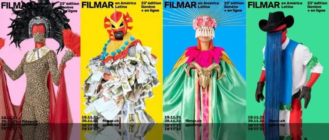
Festival Filmar 2021拉丁美洲电影节
Company/Studio:Weplaydesign
Client:FILMAR en América Latina


FILMAR is the main festival dedicated to Latin American cinema in Switzerland. The visual identity of the 23rd edition explores the myths that cross Latin America and their contemporary interpretation. Inspired by the characters of multiple carnivals or indigenous peoples and their rituals, the characters created reflect the richness of the continent. The posters displayed in the public space challenge by the attitude of the characters who seem to want to establish a dialogue with the spectators. The masquerade is more than ever a space where we play, replay and reinvent ourselves.


Wayfinding & Signage Design for Central Park中央公园导视系统
Company/Studio:Lopez Design
Client:Godrej Properties Ltd. & GPL design studio


A comprehensive wayfinding and signage system for residential central park. The wayfinding strategy connects the major zones and destinations of the park, along with the various health loops.We stayed true to the ethos of the project by reflecting on nature and sustainability, using reclaimed teak wood for the signage The system exhibits modular flexibility to integrate different sign typologies,minimising clutter.Symbols of local birds are burnt into the wood, fostering local pride and a strong connection through the brand imagery.


100 Years of Mingei: The Folk Crafts Movement民艺100年:民间工艺运动

Company/Studio:aizawa office Inc.
Client:The National Museum of Modern Art, Tokyo东京国立近代美术馆


Mingei (folk craft) was created in 1925 by Muneyoshi Yanagi, Shoji Hamada, and Katojiro Kawai. Mingei is a social movement that has lasted for 100 years and advocates "finding beauty in everyday utensils and aesthetically transforming life and society. While profoundly understanding traditional mingei, the design attempted to evolve into a new expression by fusing tradition with a modern perspective for this 100-year milestone. The simple, white-based layout with a strong presence symbolizes "everyday life tools" while attempting to create an affinity with the beauty of rustic tools.


CARGO, London伦敦货运品牌形象

Company/Studio:Socrates Communications
Client:Blackstone


CARGO is a substantial office development at the epicentre of London’s Canary Wharf. Requiring a brave new identity, the result is a diverse brand language inspired by the area’s rich trade heritage. Centralised around a bright and colourful palette, mixture of iconography, photography and collage, the brand tells a compelling story of a unique and playful lifestyle destination. Bold, condensed typography is evocative of the packaging associated with trading, and from branded crates to an animated website and social media, a dynamic, multi-layered landscape is at the forefront of its design.


ancora文具品牌设计

Company/Studio:Harajuku DESIGN Inc.


"ancora" is its own brand store selling fountain pens and stationaries. Nowadays digitalisation and Information & Communication technology has been progressing rapidly. On the other hand, "ancora" focuses on the revival of analog/in person communications. "ancora" reconsiders these analogue values which your own way of writing, drawing from your heart, providing "Fun", "Thoughtful consideration to others" and "Surprising" of stationeries.


BEI IMMO房地产品牌重塑

Company/Studio:Dubl Design Studio

Client:BEI IMMOBILIERE


Nous sommes heureux de vous présenter la nouvelle identité visuelle de BEI IMMOBILIère. Avec le développement de leur groupe, ils ressentent le besoin de mettre à jour leur style existant. Nous y avons ajouteé une nouvelle perspective afin qu'ils puissent suivre le rythme. Sans aucun doute, le leadership de style mis à jour servira de tremplin pour atteindre de nouveaux sommets de leur entreprise. Rebranding complet


“Volume Inc: This Will (Not) Be Easy” exhibition展览

Company/Studio:Volume Inc.

Client:Bolivar Art Museum / University of Kentucky


Pinterest, Instagram, Behance, and all the other visual-rich platforms we scroll through regularly barrage us with the pristine, perfectly photographed results of creative toil, but rarely the philosophy or blood-sweat-and-tears process that goes into getting to that point. Could our exhibition be the antidote to this? The result was Volume Inc: This Will (Not) Be Easy. Where one would usually expect to see the actual work first and foremost with the philosophy and process is reduced to wall text (if seen or read at all), our exhibition completely reverses that hierarchy.


Spirits bottles for Feinbrennerei Sasse烈酒包装设计

Company/Studio:sieger design GmbH & Co. KG

Client:Feinbrennerei Sasse, Lagerkorn GmbH


For six limited-edition spirits, sieger design has developed refillable bottles that feature a striking, solid, rectangular form and geometric patterns on all sides. The premium-quality collection is set apart by its elegantly cut, gleamingly polished stoppers and the black and white labels with streamlined typography. A deluxe black box presents the bottles with their individual subtly glistening patterns visible on the matt surface. After undoing the magnetic clasp, the box opens like a deluxe book. Next to the bottle, a booklet with further information and special recipes is inside.


TesiRare

Company/Studio:mimicocodesign
Client:Cescon Italo Storia e Vini S.r.l.


The TesiRare is an organic wine collection. The hand-drawn labels is print a two-color silkscreen with some elements in relief to emphasize the tactility of the experience. The composition is embellished with small details in gold leaf. The lunar cycle is a visual metaphor for the dialogue established with nature. The importance of the sun, on the right, in balance with the phases of the moon. A second graphism, in the lower part of the label, depicts an energy exchange between the sun and the earth, in the center the atom, the smallest and most indivisible unit of matter.


Löwen

Company/Studio:CHINA RESOURCES SNOW BREWERIES

Client:CHINA RESOURCES SNOW BREWERIES


The Lowen series has three categories, namely Löwen White Beer, Löwen #485 Rosé and Löwen #703 Cheery. Based on the Belgian style witbier, the package design of the series uses innovative dynamic icons like bright polka dots to represent each category, which juice up the style of the package and ensure a visual clue to help users distinguish between the three categories. Additionally, the font of the product name has been upgraded to a modern style, enriching its visual effect. Also, the symmetrical illustration of the beauties and the lions further adds a conspicuous style to the package.


Dauphin Pastoureau坚果油包装

Company/Studio:Dauphin Pastoureau Sas


Founded in the 15th century, Dauphin Pastoureau nut oil comes from the Perigord in southwest France. The outer packaging of this series integrates innovation into its traditional style. Employing a logo of the hand-drawn waterwheel of the brand's estate when it was founded, the labels select the original colors of different nuts as main colors, and are supplemented by illustrations of nuts for deeper impressions on customers. The labels, adopting the modern UV printing technology, enjoy the clear tactile texture, which delivers refreshing feelings in addition to their visual ones.


Green Gold Promama- Yogurt酸奶包装
Company/Studio:TAIWAN GREEN GOLD HOMELAND CO., LTD.


Green Gold Promama- Yogurt fulfills every parents’ expectation to their children. Exploration, interests, reuse, puzzle, elements similar to building blocks are pieced together and lined moreover to pursue the core concept that children eat joyfully and parents look after them without worry.Reusable packaging not only becomes a toy which children can accompany with children and grow together, the design of the box can be a space to store products to make it be reusable and recycled.


KOFIKADA / packagings咖啡包装

Company/Studio:TOFU Studio
Client:KOFIKADA


This packaging series was designed to convey the particular quality of the Kofikada brand’s Scandinavian way of roasting coffee. So as to emphasise the Nordic nature of these products, three different troll characters with fitting names were created. Dedicated illustrations feature on the packaging and are used throughout all communications. The three expressive characters go by the names of “a Gourmet”, “a Coffee Lover” and “a Connoisseur” and have become the representatives of this Scandinavian-style coffee brand.


Gem Garden Moon light月饼礼盒
Company/Studio:Linshaobin Design Shenzhen深圳林韶斌设计
Client:Shenzhen Chaoyu Co.,


Gem Garden is a high-end Chaoshan restaurant, needs to use the Mid-Autumn Festival gift box as a carrier to promote their brand. By partially combining the full moon inside the box with the illustration outside the box, the corresponding creativity inside and outside is formed. When the light and angle are appropriate, the creativity on the packaging will present a better effect.The aesthetics of the whole design is narrative, from the outer box viewing, to the opening process, to the innermost small box, the sense of reading layer by layer is a complete design.


Colourful Imagination — Moon & tea Mid-autumn gift box月饼&茶礼盒

Company/Studio:Wukedan (Shanghai) Creative Design

Client:Vanke万科


Mid-autumn Festival,a traditional festival with regional cultural characteristics in China.We have created a unique gift box with oriental texture for this day.Bamboo box body and white porcelain tea plate show oriental elegant beauty,Moon cake with local color rice and Pu-er tea as gifts.When the gift is taken out,the box body and the cover plate constitute a tea tray,the Moon cake box can be used as a moon lamp,for drinking tea and watching the moon.Water accumulates on the cover,the moon is reflected in the water,and the natural scenery of Xinghua is perfectly restored on the square table.


KOREA GOHEUNG YUZA WINE韩国柚子酒

Company/Studio:Sundesign Brand&design(Beijing)Co.Ltd

Client:KOREA GOHEUNG


Under the initiative of the Agricultural Science Research Institute of Gojo County, South Korea, the local yuzu wine developed into yuzu wine. Grapefruit wine is less harmful to the body. Grapefruit contains a lot of vitamin C. Drinking a glass of wine each time is the healthiest and can improve the body's immunity. The whole design tells the story of ancient Korea and the legacy of the Three Kingdoms. The history books record the story of Huanxiong's son and Xionghu. The design of the bottle uses a combination of a goblet and a bottle, which can be used as a wine bottle after drinking.


Butterfly Acrobat
Company/Studio:Ximena Ureta Design Studio
Client:CCL Label - Chile.


Butterfly Acrobat is an act of freedom and hope, a poetic response to the pandemic. The tale of Butterfly Acrobat, Amazing Edition, is the fantasy of a woman who can fly during her circus act. Mara is the mysterious butterfly acrobat. Thousands of butterflies flock in a colorful torrent in the air under the stage lights, their wings, flower - shaped, open and close to the rhythm of music and using their delicate silk threads, they fly among the audience. Ladies and gentlemen, we would like to present. The most delicate and amazing act in the whole world.


"Tralock"旅行箱锁包装
Company/Studio:Freelance
Client:Concept design


Tralock is a travel suitcase lock. The packaging was created starting with the name and ending with the design of the packaging itself.The task was to do something extraordinary with a packaging that manufacturers do not usually design. The main idea is simple. Traveling is something that brings emotions, moments and bright colors to people's lives. The execution of the design in these colors conveys this idea in a full way. The name is a mix of travelling and lock. All elements are thought in a travelling style, and the letter "o" in the logo in a form of lock hole.


Pinot Noir Rosé Brut by KRESS红酒包装

Company/Studio:Jäger & Jäger GbR


Just in time for Christmas comes the new Pinot Noir Rosé Brut from KRESS, which is characterised by its almost endless variety of aromas and its incredibly beautiful colour in the glass. The design of the bottle decoration is laid out within the sparkling wine family and centres the first of the two key visuals, the stylised double cross made of 6 circles and a semicircle - with silver refined brand elements - accompanied, of course, by key visual number two, the flag waving.


文章来源:叁布品牌设计

版权归原作者所有,本资源仅供大家欣赏,学习交流,非恶意侵犯原权利人相关权益,如果侵害了您的合法权益,敬请相关权利人谅解并与我们联系,我们会在第一时间删除相关内容,共同维护好网络创作环境。


RECOMMENED

往 期 精 选

2022年十大设计趋势预测

2021日本字体设计年鉴电子版!


本文来自微信公众号“青圭設計學社”(ID:qingguisheji)。大作社经授权转载,该文观点仅代表作者本人,大作社平台仅提供信息存储空间服务。